The Hanger
Designed by Jason Higham and built by Miles Construction, this outside-the-box design pays homage to its surroundings, while ticking all the boxes for its owners
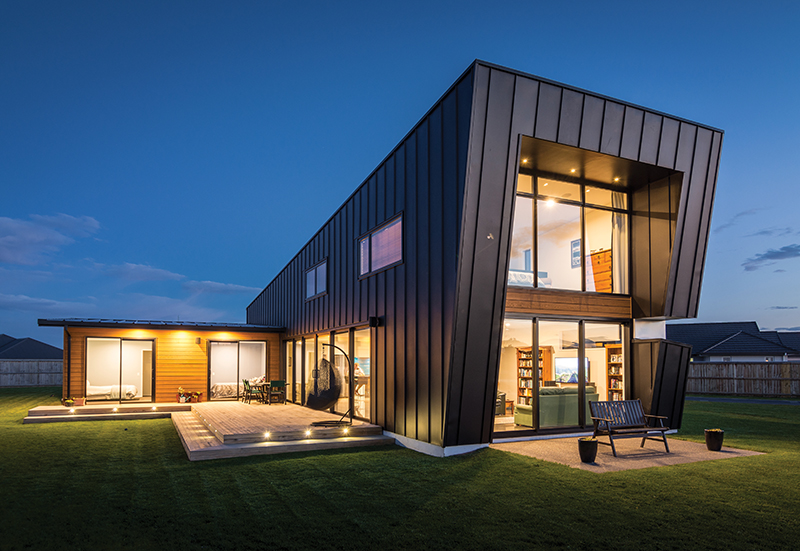
For architectural designer Jason Higham, the Cummings’ residence was an opportunity to think outside the box. ‘Janet and Bernie Cummings were looking for something unique and quirky’, he shares. ‘They had a clear idea of what they wanted to achieve in terms of bedrooms, bathrooms and living spaces; but how it would all come together was up in the air.’
Nestled on the edge of a sub-division in West Melton, the surrounding pastoral landscape and the site’s previous life as farmland provided inspiration for Jason. ‘I wanted to reference the use of the land – which inspired the original idea of a barn or shed. But I knew it had to be more.’
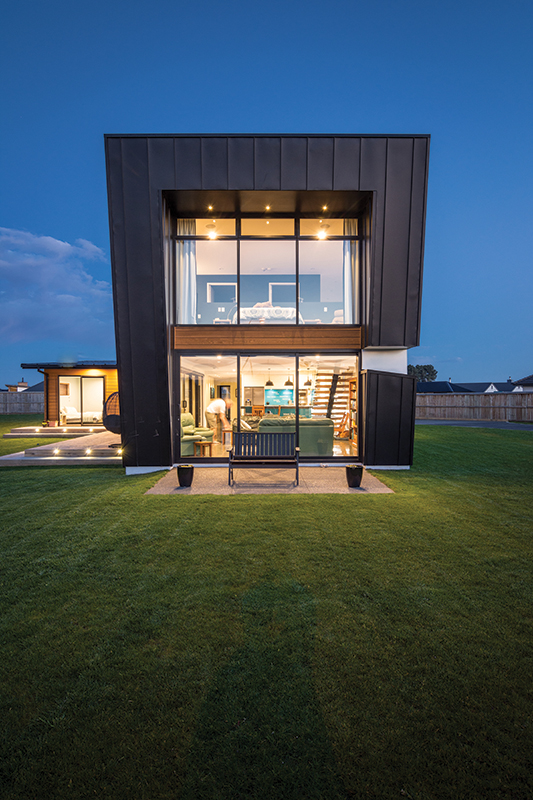
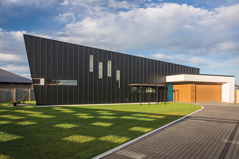
The ‘more’ he refers to has become what the neighbours fondly refer to as ‘the hanger’. A bold structure, which despite its angular shape and strong exterior lines, has a simplicity that endears it to lovers of the unique.
For Bernie and wife Janet, the design grew on them. ‘It isn’t unexpected for us to do something unusual’, laughs Bernie, ‘and we knew we wanted to build something different; so we went with it and haven’t looked back.’
‘A design like this doesn’t normally fit within the parameters outlined by a subdivision developer’, explains Jason. ‘The roofline, in particular, was well outside their rules; however, I noticed in the footnotes of their rules that alternative materials, roof pitches and the likes may be considered providing they do no not adversely affect the development.’ So, once they had obtained a ‘thumbs-up’ from the developer, construction on the home was able to begin.
Translating the home from drawing to reality was Miles Construction. ‘We selected Miles Construction based on their reputation’, shares Bernie. ‘In a house like this, where you have twenty-metre expanses of walls, you want them to be straight!’
Like Jason, the Miles Construction team had been involved in the design and build of Bernie’s sister’s home. ‘We were very impressed with what the two companies had achieved there’, continues Bernie, ‘which gave us the confidence that they could, and would, achieve what we wanted’.
Like many others involved in the property, Alastair Miles and his team were excited to be part of such an interesting and unique project. ‘It is a pretty cool home’, he enthuses. ‘While we are seeing similar shapes on the hill, the home is very different for its location, and we are immensely proud of what has been achieved.
‘They were great clients to work for’, he continues. ‘They knew what they wanted to achieve and had the confidence to do it.’
With the day-to-day construction of the home overseen by Project Manager Roger Cornelius, Janet and Bernie were able to achieve exactly what they wanted. ‘Roger was terrific. He listened to what we wanted and understood our vision, which made the whole process so much more enjoyable and streamlined.’
Despite having never built before the couple had done their homework and were prepared for the many decisions that came their way – which included selecting the perfect exterior cladding.
‘We wanted the home to be as low-maintenance and future-proofed as possible’, continues Bernie. ‘The kids had flown the nest, so we wanted to downsize and build something that we could enjoy – rather than spend every weekend working through long to-do lists.’
A factor that saw them elect to use a product for their exterior walls that is normally reserved for the roof. Working alongside Miles Construction to achieve this unusual cladding request was CS Roofing Canterbury.
As specialist installers in longrun iron roofing for the residential, commercial and architectural markets, they are no strangers to innovative design decisions, and relished being hands-on with this project.
A bold structure, which despite its angular shape and strong exterior lines has a simplicity that endears it to lovers of the unique.
‘Bernie and Janet started the conversation about the roof and wall cladding with us in 2014’, explains owner Jenny Maxwell. ‘We then worked with them during the design and planning phase, right through to installation, to get it right.
‘There was a high level of craftsmanship required’, she continues. ‘There are a lot of areas at eye level and any imperfections would be easily spotted; so, we took a lot of time and care to ensure that the finishing was top class.’
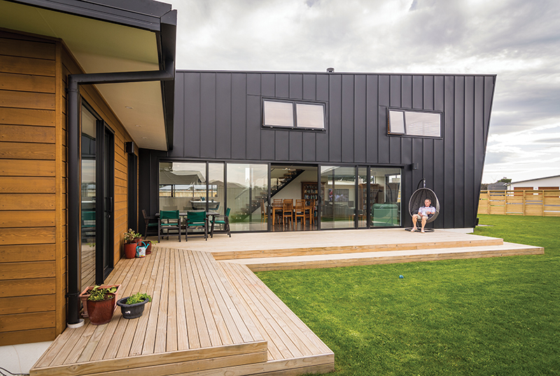
Reflecting the purpose of each part of the home, three separate roofing profiles work harmoniously to achieve a seamless finish. Euro-Tray Lite is utilised on the walls, while High Five and Solar-Rib are found on the roof.
‘The tray profile achieves the desired architectural look on the walls’, shares Jenny, ‘while the functionality of the High Five meets the needs of the flat roof, and the Solar-Rib offers the opportunity to carry photovoltaic panels with no distraction to the overall finish of the home.’
The roofing manufacturer also enjoyed the opportunity to showcase Calder Stewart products in an innovative format. ‘It is great to see our products used outside of the norm’, explains Regional Manager, Jake Walker. ‘The end result is an exciting showcase of what can be achieved with good products, good installers and good design.’
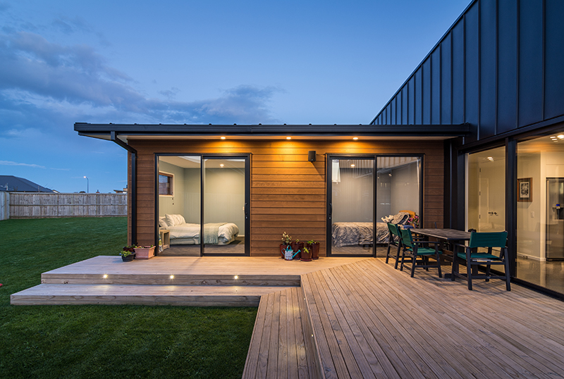
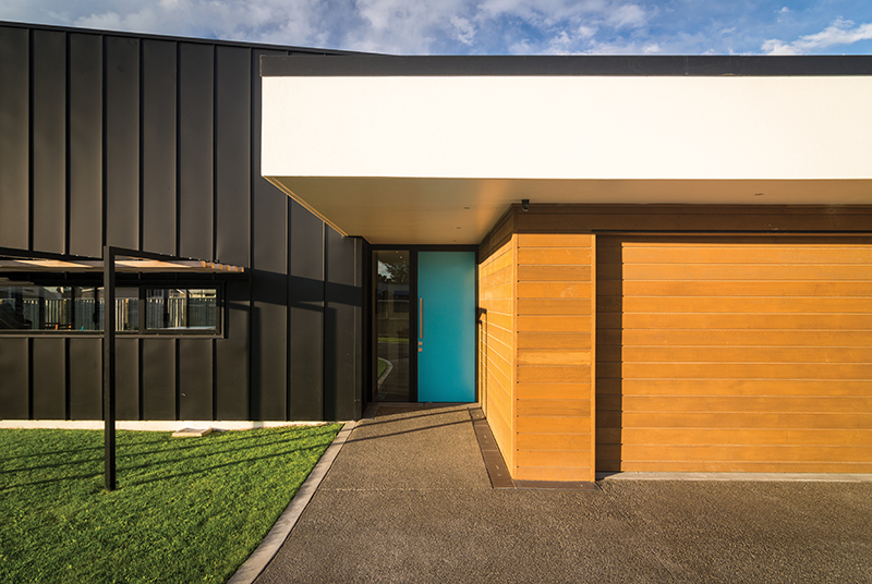
To contrast the dark textural element of the rest of the exterior, a Rockcote EPS40 Insulated Façade System and cedar paneling were selected to cover the entranceway and bedroom wing of the home.
As Jason explains, the combination of cladding materials works to enhance the design of the home. ‘With the changes in the exterior cladding, the different forms of the home have their own identity. The plaster cladding works to visually anchor everything.’
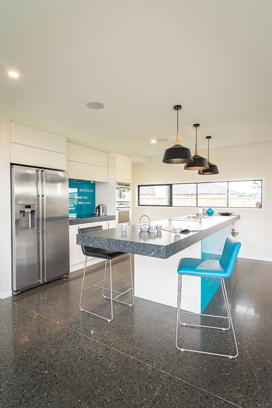
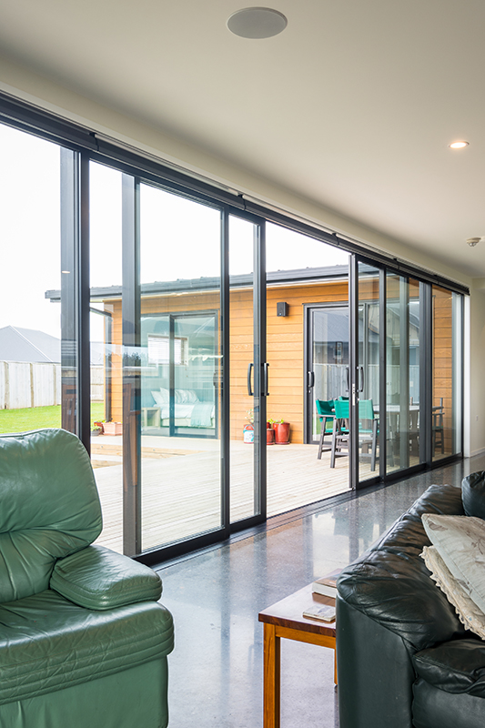
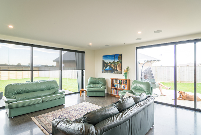
In contrast with its dark and bold exterior, the interior of the Cummings’ home is light and bright. ‘Part of our objective was to make it feel like a bach’, explains homeowner, Bernie. ‘We wanted it to be livable inside and out – to achieve a relaxed feel that allowed us, our friends and family to come in, sit back and enjoy the home.’
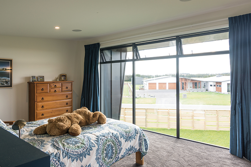
Views across pastoral land out to the Southern Alps aid the notion of being on holiday, and the interior colour scheme enhances it further. Regularly working alongside Miles Construction, painter Daniel Smith from Smithy’s Decorating takes pride in the ‘picture perfect’ finish his team achieves every time.
‘We approach every job with the same attention to detail and precision’, he explains. ‘In a home of this nature, where the interior contrasts so strongly with what you see on the outside, it is essential to get a smooth, high-quality finish – the neutral tones of the walls and ceiling reflect the light and so highlight any blemish.’
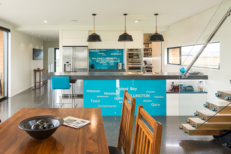
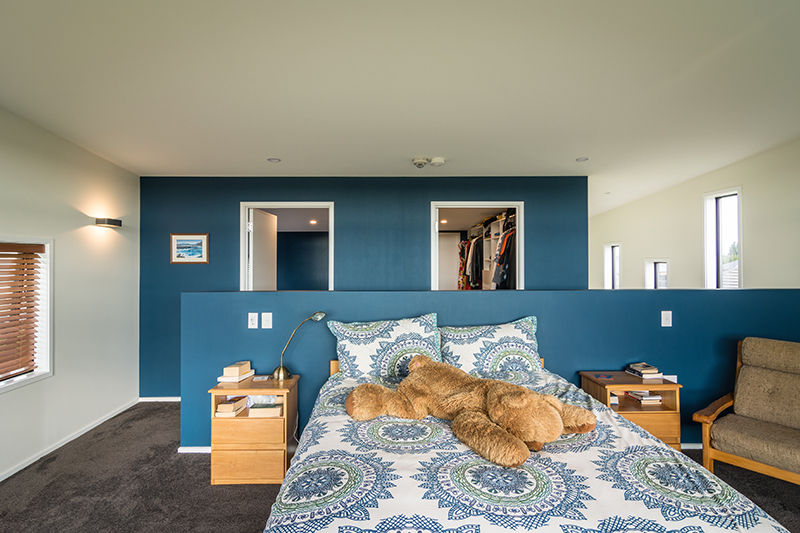
While Resene Rice Cake graces the ceiling and walls, a bold use of blue acts as a highlight: from the front door, to feature walls in the master suite, to the kitchen. Taking inspiration from a beloved piece of art, which hangs pride of place in the entranceway, Janet translated the shades of blue found in the piece from the canvas to the wall. ‘She made it all work’, enthuses Bernie. ‘She had the vision and it has come together beautifully.’
Complementing the interior colour scheme is the addition of Godfrey Hirst Valley Charm solution-dyed polyester carpet in colour Charcoal. Found in private areas of the home, the luxuriously soft, deep-piled carpet was supplied and installed by Floorpride Mandeville Street.
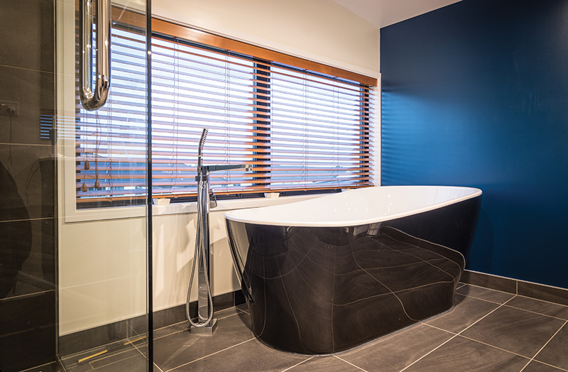
With a strong emphasis on service, Floorpride Mandeville Street helped Bernie and Janet to satisfy all their flooring needs. Floorpride are specialists in hard flooring as well as carpet, and Janet and Bernie enjoyed the ease of being able to source their bathroom wall and floor tiles from the same place, selecting Paris Nero tiles for the floor and walls, and Solar Midnight mosaic tiles as a feature.
As the Drive Thru Manager at Mitre 10 MEGA Papanui, for Bernie it was a natural choice when it came to the finishing touches in the bathroom. While the vanities and tapware throughout the home are testament to the variety of high-quality fittings available, the Caroma Noir Freestanding Bath in the master ensuite is a standout – instantly igniting a sense of relaxation and luxury. With windows flooding the room with natural light and affording picturesque views, this is a tranquil space in which to escape at the end of the day.
While two of the three bedrooms are found in the guest wing at the back of the house, the master suite is a private space hidden away on the upper level. ‘It is the only thing upstairs’, explains Jason. ‘It was something that Janet really wanted and it allowed us to make the most of the views across the sub-division out to the mountains.’
In contrast to its dark and bold exterior, the interior of the Cummings’ home is light and bright.
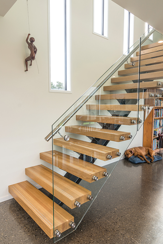
Connecting the two levels of the home is a floating staircase. Fitting with the couple’s desire to achieve an open, light-filled interior, the single steel stringer timber tread staircase adds a textural element to the interior without overpowering it. A feat enhanced by the addition of a glass balustrade, designed and installed by Canterbury Balustrade. ‘The toughened glass is fully utilised and has polished edges to achieve clean lines and an aesthetically pleasing finish’, offers Director, Hamish Gillespie.
Providing security and safety, the balustrade also acts as an enduring architectural feature designed to enhance the perception of space within the home.
However it is not simply the bold design that makes this home stand out. Designed and built for life, it has recently been awarded a 5-Star Lifemark Rating.
‘Lifemark design principles are about achieving a home that is usable, safe and accessible for an ageing and changing population’, explains General Manager, Geoff Penrose. ‘The Lifemark Star Rating shows how well a home will suit occupants’ needs over a lifetime.’
‘Homes designed to the Lifemark Design Standards use space in the right place’, explains Geoff. Speaking of the Cummings’ home, he explains that, ‘the doors and corridors have been made a little wider than standard, and access in and around the house is level and spacious, so it’s easier to move around with mobility issues, move furniture or simply carry shopping inside.
‘Door handles, window latches and tapware around the home are lever-actioned, to make them easier to grip and use’, he continues, ‘while light switches and door handles are all aligned at the same height’.
Both Jason Higham and Alastair Miles of Miles Construction discuss Lifemark Design Standards with each one of their clients. ‘Lifemark just makes sense’, shares Alastair. ‘You don’t know what life is going to bring and, by future-proofing your home, you are ensuring it can change and adapt to suit you and your needs – and even those who might call it home in the future.’
For Janet and Bernie, designing their home with safety, usability and adaptability in mind means their home is not only beautiful, says Bernie – ‘it’s that much easier to live in’.
Fondly referring to their home as an amalgamation of their ideas, wants and needs, for Janet and Bernie it is everything they wanted it to be. ‘The hanger’ is a much-loved home, and will be for some time.
Words: Lucinda Diack Photography: Mick Stephenson


