Colourful cool
Combining vibrant colour and bold visual flair with clean architectural lines, this family home in Bishopscourt, Cape Town, is a classic study in the power of contrasts
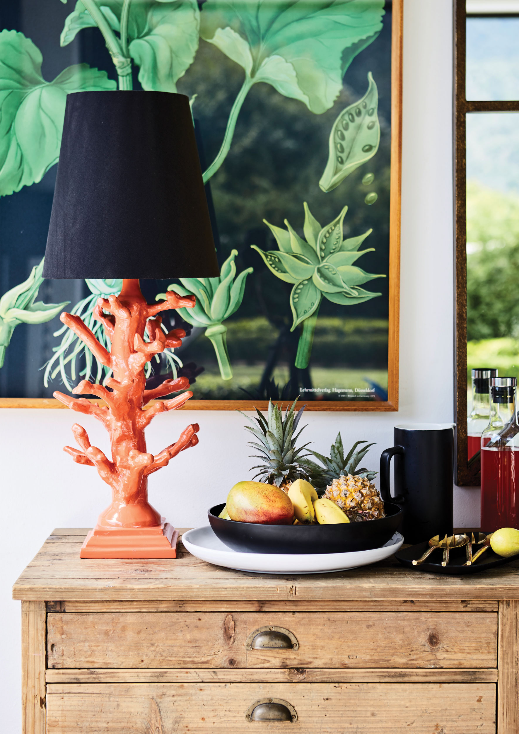
When stepping over the threshold of this gloriously colourful home in Bishopscourt, Cape Town, it is like virtually inserting yourself into the gorgeous Pinterest boards of interior designer Kim Stephen. Those boards are alive with colour – they have names like ‘Perfect Pink’, ‘Tangerine Dream’ and ‘Yellow Love’ – and yet these bursts of brightness are also framed within the crisp lines of Kim’s classic-yet-contemporary style.
The bright orange exterior of the front door, for example, opens onto a supremely elegant hallway and stairwell that features poured terrazzo floors and a textured charcoal wallpaper – as well as a tall potted palm tree and a number of artworks, including an eye-catching series of silkscreens by South African artist Stephanie Watson.
Another reflection of Kim’s penchant for classic elegance is the architecture of the house, which she describes as having ‘Georgian lines with modern edges’. Before the structure was completely renovated three and a half years ago, it was a simple, quite rustic A-frame shape – difficult to imagine now. Kim, her husband Graham and their son, Jamie (10), lived here for seven years before the remodel and Anna, who is three, came along in its immediate aftermath.
This open-plan living, dining and kitchen area is the everyday heart of the house, and it is made even more family-friendly by having a colourful kids’ play area situated just off the kitchen space. While prepping a meal, it is easy for Kim to supervise homework or just keep a quiet eye on what the children are up to.
Beyond the kids’ area is a beautiful indoor-outdoor living space that was added to the house during the renovation. It is inspired by the extensive patios and terraces that are widespread in the other South African cities of Durban and Johannesburg but are still relatively new to Cape Town houses, this ‘outdoor room’ can be closed up during more inclement weather or completely opened to the elements during the city’s long, hot summers.
The main bedroom is more muted in terms of its use of colour (a splash of it was recently added in form of new artwork above the bed) and the bathroom and dressing room have been deliberately kept separate from the bedroom rather than being typically ensuite. The separation means that Graham, who travels a great deal for work, can get up and prepare to depart without disturbing anyone else in the house.
The guest suite and guest cloakroom are both on the ground floor, off the entrance hallway and along a passageway adorned with a large Slim Aarons photographic print hung above a bright green love seat. In the guest cloakroom, the gorgeous, leafy ‘Martinique’ wallpaper is used – Kim insisted on tracking down the original version of this modern classic wallpaper, the same as that famously hanging on the walls of the Beverly Hills Hotel.
Listen to Kim talk about her history as an interior designer and the way she went about creating her own space, and the phrase that comes to mind is ‘investigator decorator’. Being raised by her mother Debbie Schuurman of Walnut Interior Fabrics in Durban, her childhood experience of fabrics obviously plays a part, but her visual style is also the product of meticulous research. She methodically tracked down all sorts of items she had envisioned as perfect for her home, ranging from those old terrazzo-tile presses to wallpapers, and from unique artworks to custom-made furniture. The combination of such a careful, thoughtful approach with an innate sense of colour that reflects so much confidence and brio might be remarkable, but that just adds to the pleasure its end result affords.
Words Robyn Alexander Photography Warren Heath


