Rustic chic
A sleek architectural update on a rustic barn, this family home in the green belt of Cape Town, has elegantly layered interiors that beautifully complement its spectacular mountain view.
WORDS Robyn Alexander PHOTOGRAPHY Warren Heath
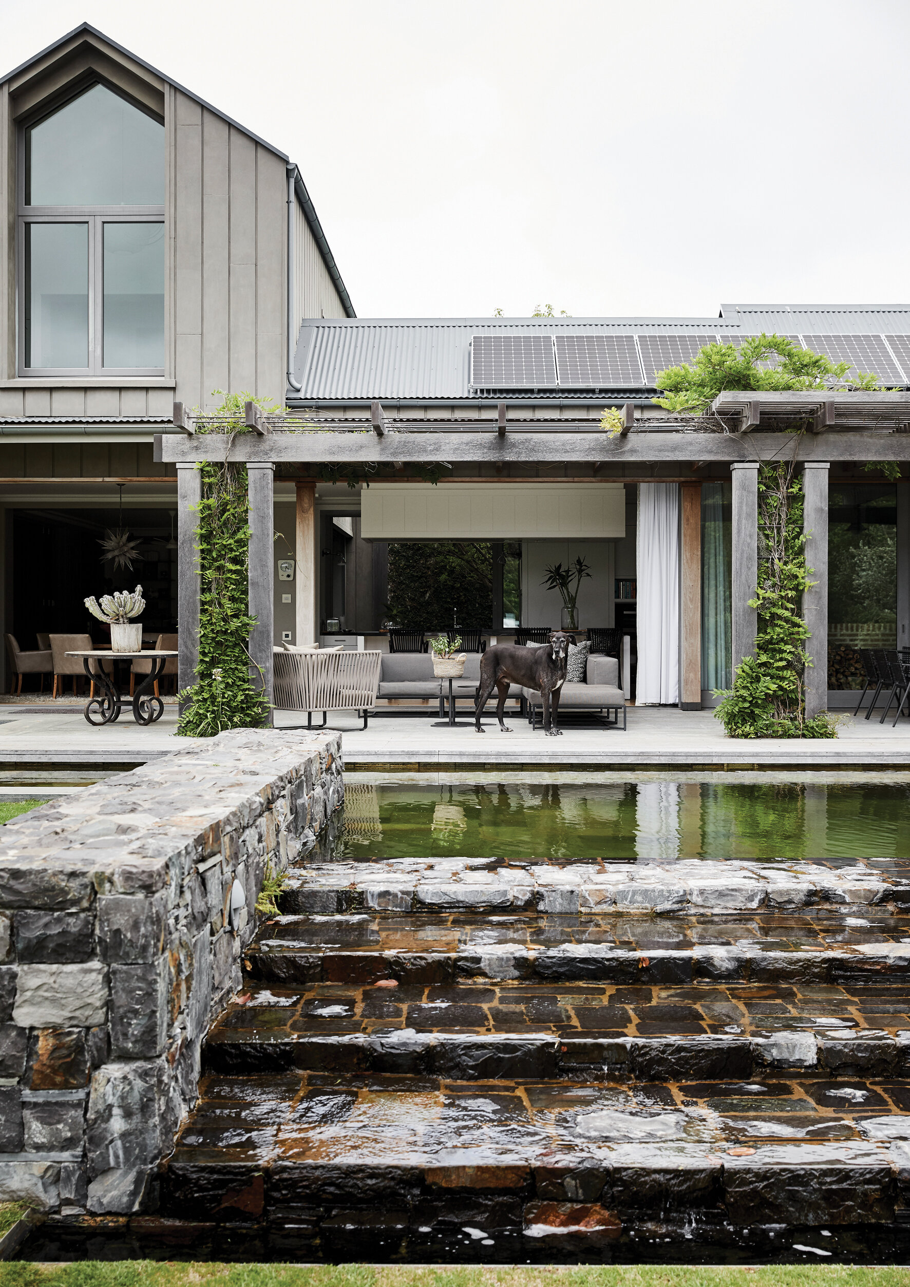
EXTERIOR The eco pool, consisting of planted filtration ponds that naturally purify the water in the swimming zone.
While some houses boldly announce themselves to visitors, others are more discreet about the way they ‘greet’ those arriving on the threshold for the first time. This home, situated in the verdant suburb of Constantia (one of Cape Town’s most desirable areas), definitely belongs in the latter category.
Of course, it’s immediately apparent that you have arrived at a large and lovely family home, with a barn-like exterior finished in a dark grey cladding that creates an instantly welcoming feel. And then slowly, the property’s hidden pleasures reveal themselves.
Once inside the front door, the layering of spaces through the house makes for an ‘unfolding’ process during which you move through a set of beautifully appointed rooms towards the front deck. As you do so, a panoramic vista of the Constantiaberg mountain – hitherto hidden from sight by the house itself – moves into view and quite simply takes your breath away.
Homeowners Caroline Topat and her husband bought the property a few years ago after consulting with Cape Town architect Wynand Wilsenach and looking at several options in the area. The initial idea was to do a renovation of the then-existing house, but as Wilsenach explains, the project soon turned into a rebuild.
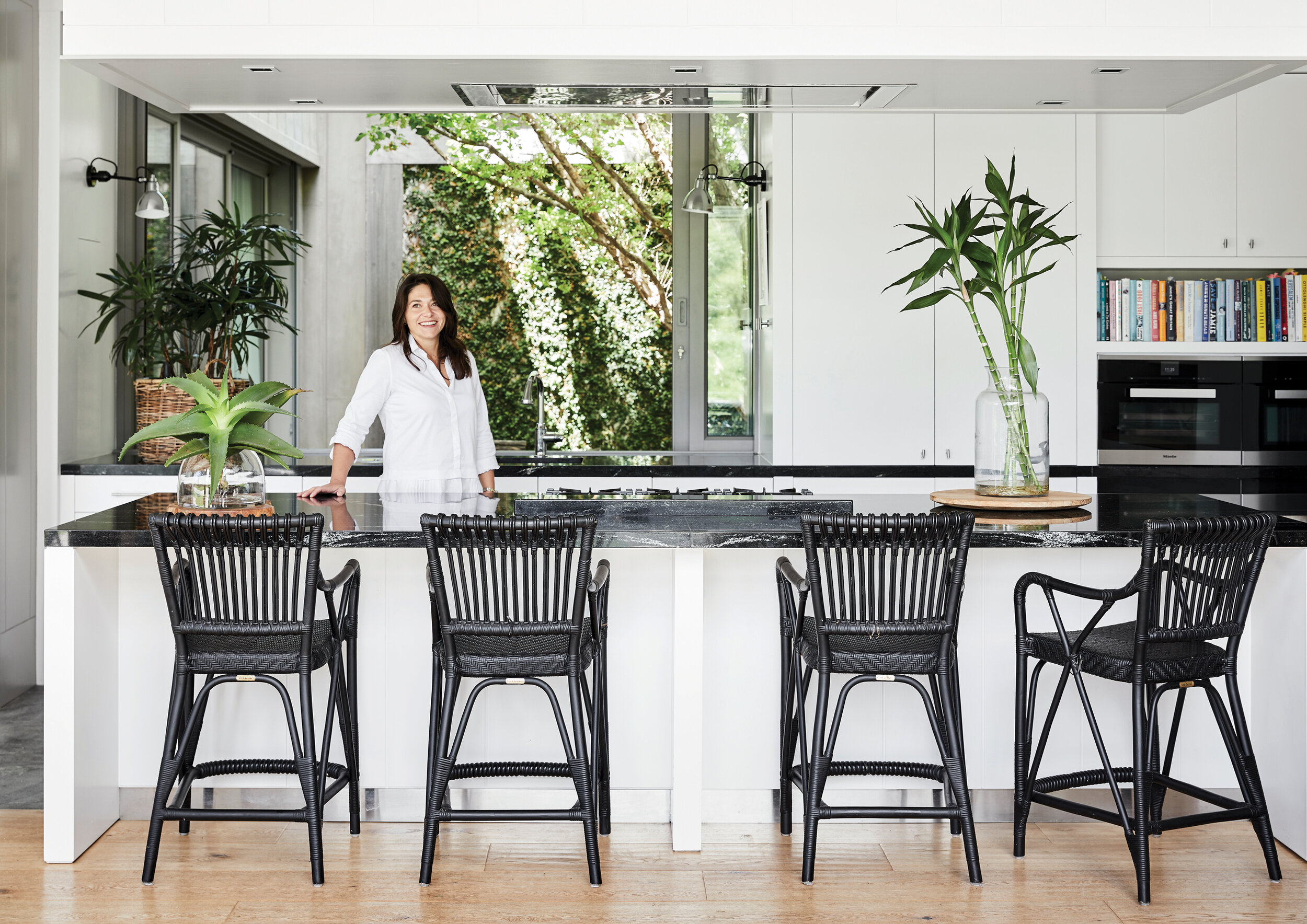
“It quickly became clear that we needed to remove the house entirely and start from scratch,” says Wilsenach. “It allowed us to move away from the typical gabled, sash-windowed Constantia house and instead to design something more modern and edgy. The Topats were open-minded about how we could approach a more modern barn-type architecture.” The house features a sleek, contemporary kitchen placed front and centre. More than the heart of the home, this is the family’s nerve centre and Caroline’s favourite space in the house. From here she has an eye on just about everything that’s going on – from children’s homework being done in the adjacent study area, to the playful antics of her beloved dogs, Heston and Ella – while also being able to keep track of swimmers in the eco pool outside and stay in tune with that view. And all while she’s whipping up a weeknight supper, or a multicourse weekend lunch for friends.
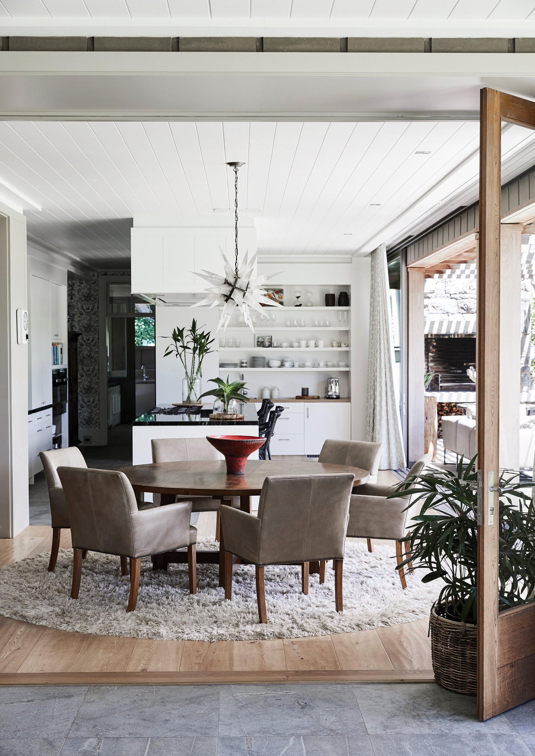
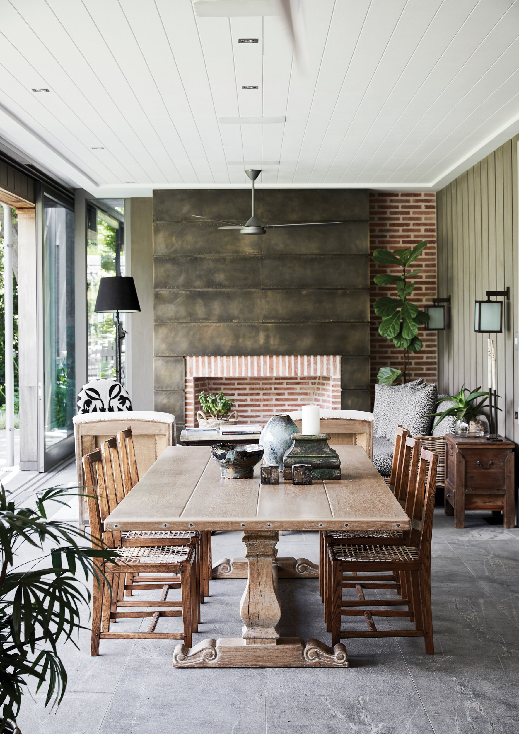
From the kitchen, a series of interconnected living spaces extend sideward: an interior dining room furnished with a solid wood table by Cape Town’s classic wooden furniture specialist, Pierre Cronje, leads onto a long indoor-outdoor patio that includes a further dining area as well as a lounging space. All these spaces open out completely onto the front garden via doors that rack right back, opening the house entirely to the outdoors. Says Wilsenach, “We designed it such that the house slides open one hundred per cent from the kitchen across the dining room and the covered veranda with big double-glazed sliders that can be moved completely out of the way, linking the house (with minimal columns and supports) to the garden, mountain views, and pool.”
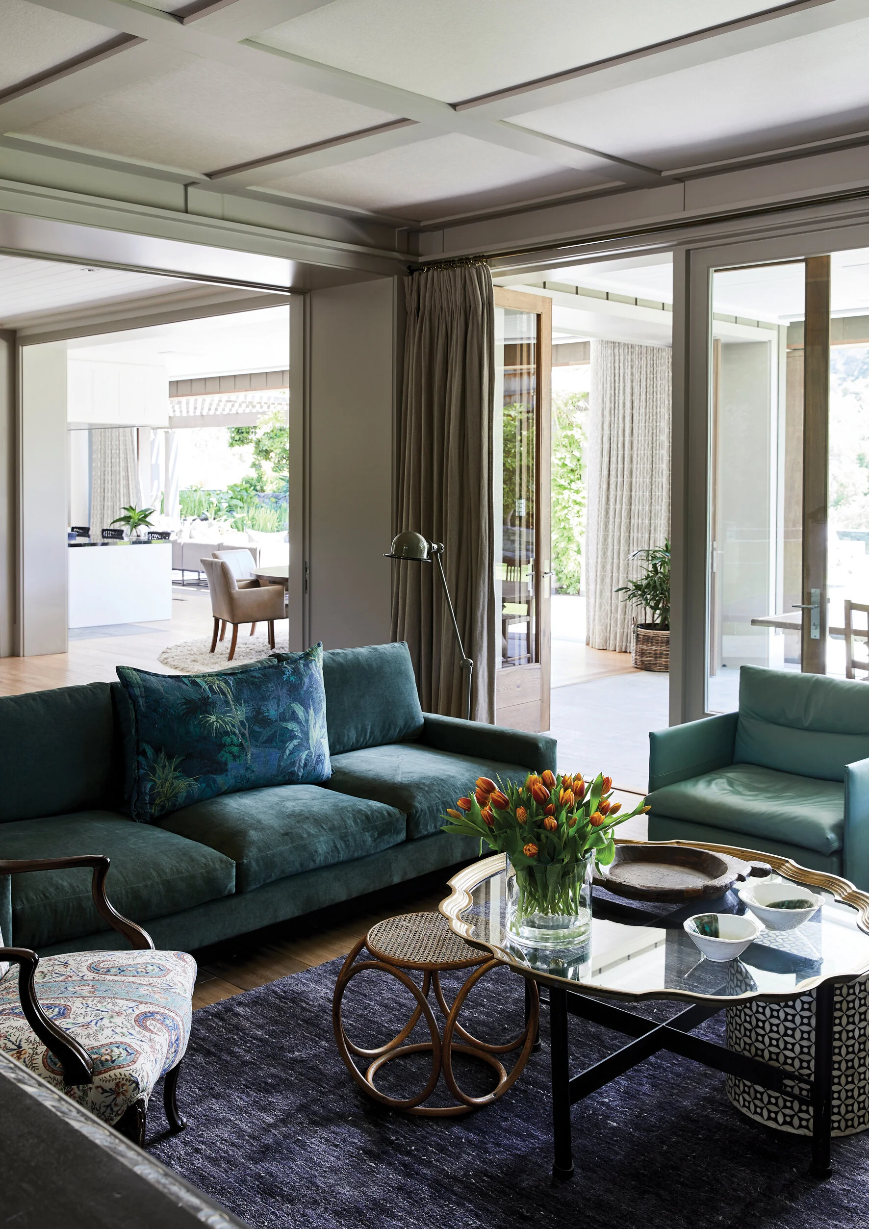
In the cosy centre of the home is the main living room, complete with comfortable, clustered seating that is just as perfect for conversation as it is suited to taking in a TV series as a family. And adjacent to that is an area that Wilsenach describes as a ‘creative hub’, which he says he used for the first time in the Topats’ home. He explains: ‘This is a long table between the kitchen and living spaces where the family works together, with plug points and drawers for convenience.’
OUTDOOR LIVING Architect Wynand Wilsenach had the ceiling fan and custom-designed wall sconce installed during the renovation.
The long wooden table – custom-made by Cape Town joiner James Mudge – in this space can accommodate several laptops and workbooks, and it is in regular use by the entire family. ‘Every time I visit, I see both parents and children working together in the same space in the heart of the house,’ says Wilsenach. ‘To see the creative hub working so well gives me great pleasure.’ A picture wall of family photographs takes pride of place in this area, while custom made shelves (also by Mudge) store books and collected treasures.
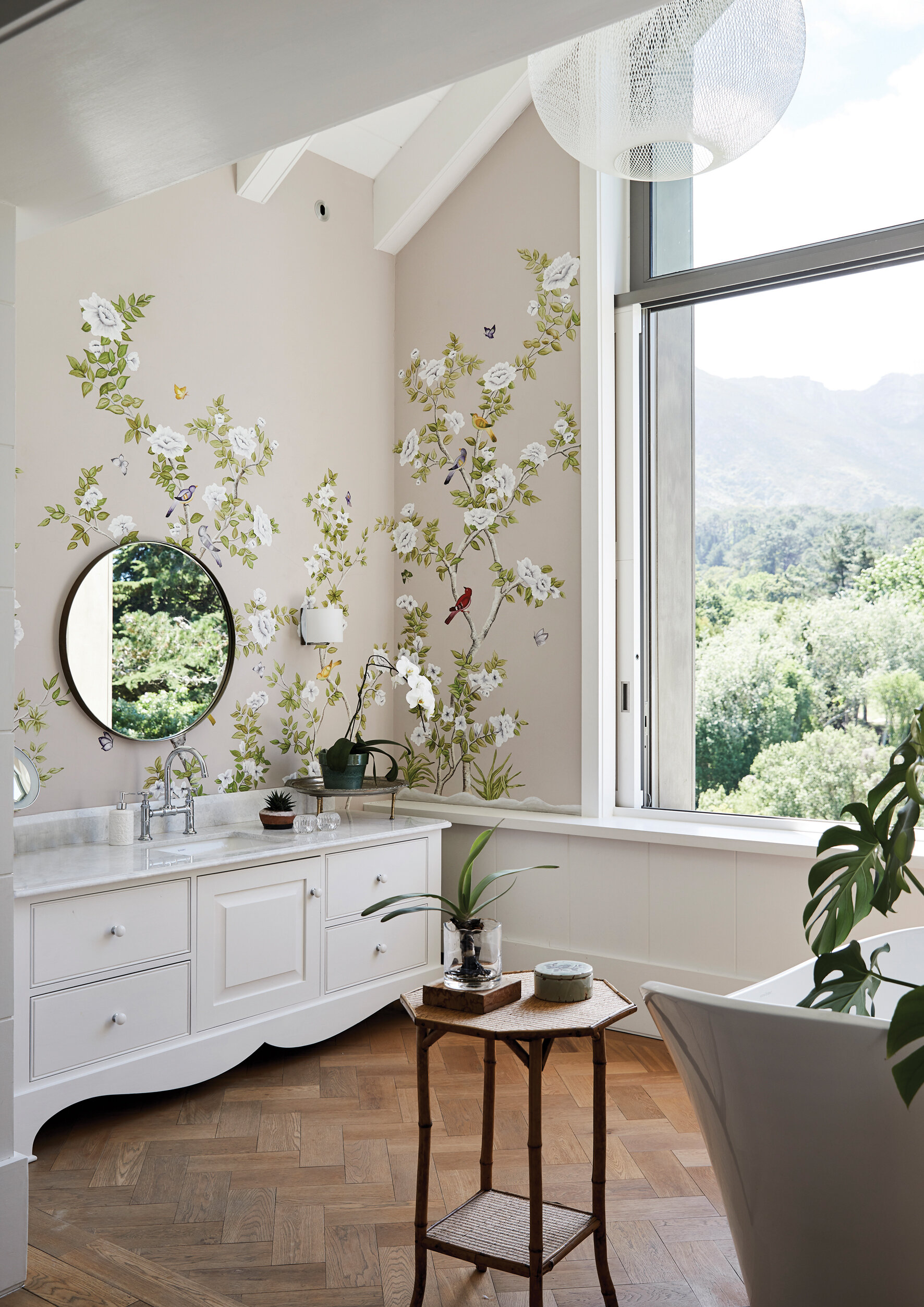
exterior The eco pool, consisting of planted filtration ponds that naturally purify the water in the swimming zone. outdoor living Architect Wynand Wilsenach had the ceiling fan and custom-designed wall sconce installed during the renovation. her ensuite Caroline’s ensuite bathroom and dressing room is an ultra-feminine space. The bath is positioned to enable its occupant to take in the picture-perfect view. The walls were hand-painted with chinoiserie-style decorations. his ensuite On the opposite flank of the bedroom is another ensuite bathroom and dressing room: here, sleek masculine style prevails.
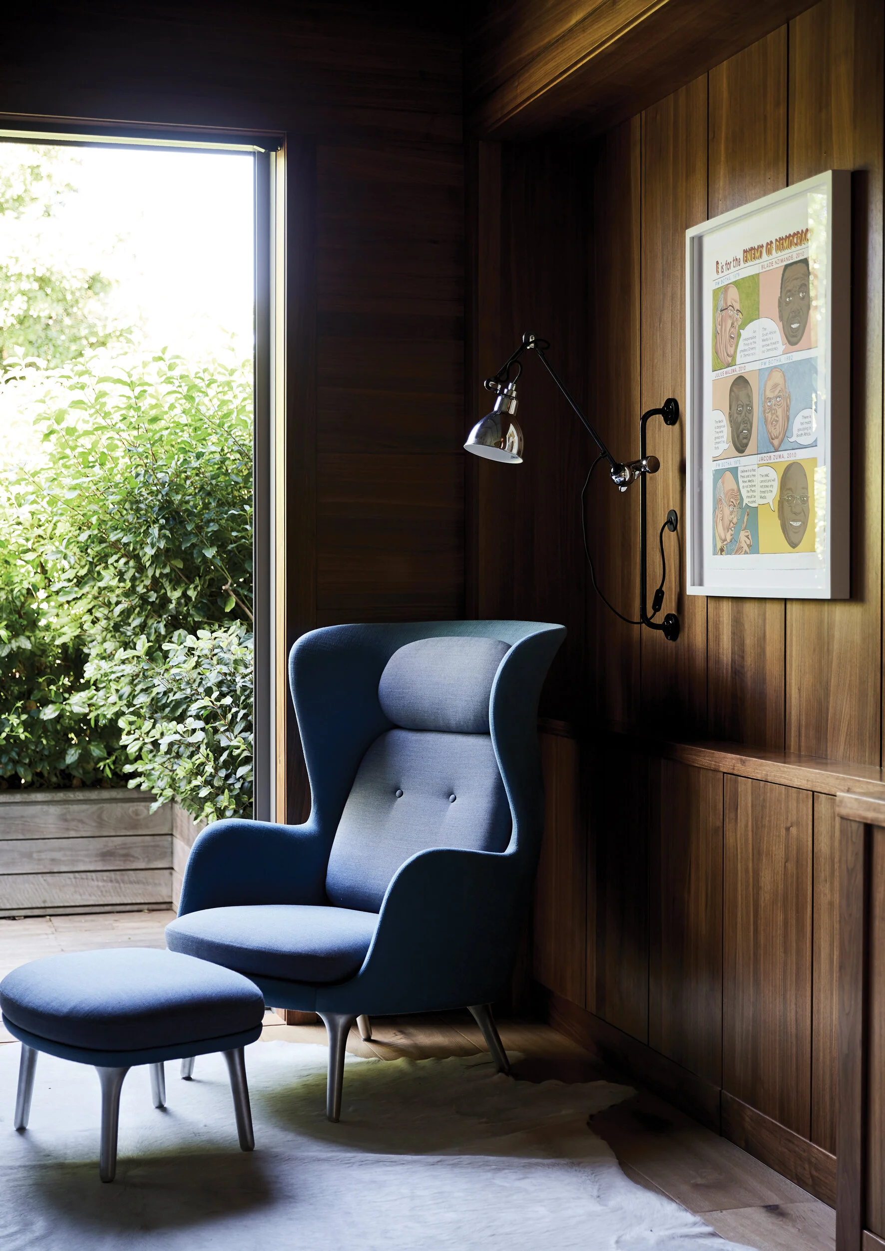
Interiors specialist Andrea Graff worked on the interior design of the house from the start, and during the process, she and Caroline became firm friends. They saw completely eye to eye in terms of creating a family home with an heirloom feel while agreeing that the interiors should not feel stiff or formal. And they don’t. The rooms feature considered combinations of a range of textures via the use of luxurious upholstery and curtaining fabrics, as well as a layer of comfort created by perfectly placed footstools and side tables, and indirect lighting.
Colour is kept subtle, with hues from nature – including a series of green tones, as well as shades of grey and wood – predominating. These are punctuated with items in rattan and metal, as well as a few boldly monochrome pieces. And objects including vases and vessels in slightly brighter green and blue tones, plus a range of contemporary artworks, add a final finesse to the interiors.
HIS ENSUITE On the opposite flank of the bedroom is another ensuite bathroom and dressing room: here, sleek masculine style prevails.
HER ENSUITE Caroline’s ensuite bathroom and dressing room is an ultra-feminine space. The bath is positioned to enable its occupant to take in the picture-perfect view. The walls were hand-painted with chinoiserie-style decorations.
Graff’s interior design style is characterised by “a deep respect for tradition filtered through a contemporary lens”, she says. In this project, she was very much responding to Caroline’s brief: “Lots of dogs, lots of kids, comfortable, practical and unique!” This is evident throughout the house – but especially in its most private spaces, the bedrooms. There are three ensuite children’s rooms on the ground floor, and the first floor is given over to the master suite, with a matching duo of adjacent dressing rooms and ensuite bathrooms.
The final sign that all the users of the home’s spaces were kept in mind when it was conceived is the utterly charming treehouse, also a unique design by Wilsenach. Situated across the pool and lawn in the tall trees on the other side of the garden, it’s perfect for adventures and games aplenty – and is yet another demonstration of the fact that for the Topat family, home is the very best place to be.


