The long house
Multidisciplinary designer Mia Widlake and her artist and adman husband Rui Alves have given an architect’s former home in Johannesburg a new lease of life.
WORDS Graham Wood PHOTOGRAPHY Elsa Young
Could Mia Widlake have discerned the hand of a kindred spirit when she first saw this “long and skinny” house in a cul-de-sac in her neighbourhood? Mia is known for her versatility as a designer. She has tried her hand at everything from textile-, lighting- and furniture design, to residential, corporate and retail interiors. She’s also renowned in her home city for her eye for the quirky detail and her ability to find objects with personality and integrate them into her interior designs. She seems to have an aversion to dull, formulaic spaces.
Mia certainly recognised that “The Long House”, as it has been nicknamed, where she lives with her husband, Rui Alves, and their two children, Stella and Oliver, was anything but a cookie-cutter design the minute she saw it. She instantly saw past its biscuit-coloured face-brick walls and generally dilapidated state and discerned that it was something architecturally special, with quirky details and personality to boot.
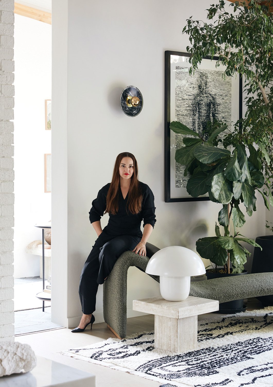
DISTINCTIVE CHARACTER Interior designer and owner Mia Widlake preserved the character of this mid-century home and added her own distinctive style.
The house, she discovered, was designed in the early 1980s by local architect Patrick O’Brien as a home for his own family. O’Brien was something of a design Renaissance man – working across landscaping and interior design as well as architecture, designing furniture, too, and writing widely on all topics. He had a passion for sports cars and motor racing (and even tried his hand at automotive design) and was both thoughtful and experimental in all his designs. He was also a talented artist.
The Long House had floor-to-ceiling windows and doors throughout – nothing as mundane as a windowsill or lintel. O’Brien described the design of the roof as slim and lightweight, “similar to an aircraft wing”.
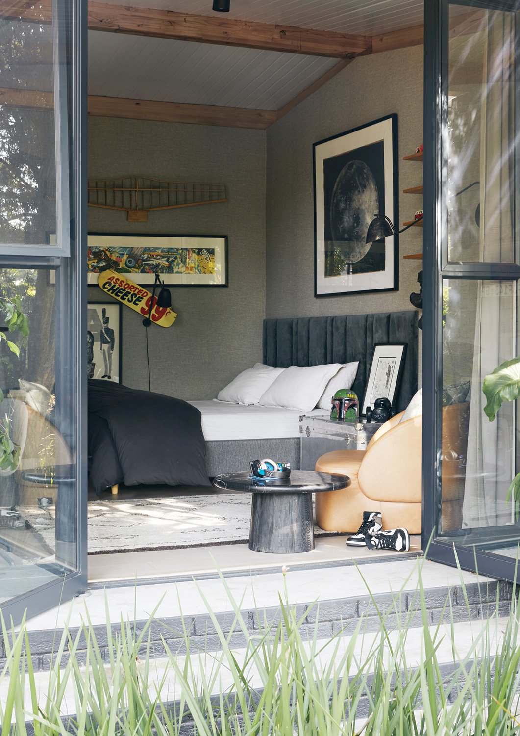
One of the things that attracted Mia to the house was the way the rooms related to the garden. “Rui and I absolutely love plants and greenery and gardening,” she says. The interior of the house and the passages and courtyards around it are deftly woven together, becoming extensions of each other via those lovely tall windows and doors. “I love the courtyards and little spaces that enclose the house,” says Mia. It’s as if the gardens come right inside, and the rooms extend all the way to the boundary walls. The trees and plants outside fill the rooms with a jungle-green dappled light.
The house, however, was in need of a refresh. Mia’s architect sister-in-law, Kate, helped plan the subtle but decisive renovation that preserved everything good about the house while making it thoroughly liveable once more. Essentially, she and Mia extended that wing-like roof outwards, allowing them to create a new, larger dining room off the living area. It also meant that bedrooms could all be larger, open directly into the garden, and each could have an ensuite bathroom. Kate was careful to keep in mind the natural light and proportions of the original rooms so that their character remains. “The openings are exactly as they were,” says Mia. “I just put new windows and doors in.”
The garage and carport were converted into a new family lounge and a guest suite. The original roof – which O’Brien noted took just 11.5 hours to install – was replaced in a day. While Mia reused the face brick wherever she removed a wall so that even the alterations would remain consistent with the existing walls, most of which were kept in place, she coated them with slurry and gave them a lick of paint. “We did the outside black and the inside white,” she says. It was a simple but effective modernising refresh. New timber floors warmed up the living spaces, giving them a new dimension of luxury, and slate tiles were introduced to the kitchen and some of the other areas.
LEAFY SECLUSION The front entrance to the home is approached via a gravel-covered, leafy courtyard with swimming pool.
Despite the initial impression of slickness in Mia’s interior designs – the palette of monochromes, charcoals and smoky, moody tones – their real magic lies in the layers and layers of detail she works into them.
Her first point of departure when designing interiors for clients is often something they already have, or something interesting she finds that seems to resonate with them personally. She wants people to feel at home, not alienated in their own space. Similarly, she says, “If I’m going to own something, it has to mean something to me.”
She has no shortage of such starting points herself. As both a collector and a furniture designer, her house is filled with vintage items collected over a lifetime. “I’ve always liked vintage clothing and vintage furniture,” she says. “I was 16 when I bought my first pair of vintage chairs.”
Funnily, this doesn’t translate into sentimentality, but rather an eye for the interesting object, the telling detail that gives an object an aura, a personality or a presence. By way of example, she points out the vintage wig moulds she displays on the server in the dining room. “You can see the little pin marks in them,” she notes.
NATURAL TEXTURES Luxurious textures adorn this bathroom that’s bathed in natural light.
Mia has a pathological hate of waste, so as with the architecture, she likes to save, upgrade and reinterpret what exists. “The building industry creates so much waste,” she says. “Every time I do something, whether it’s designing a light or a piece of furniture, I like to reuse something that’s existing rather than try and find something new.” She loves the “dirty work” of going to stone yards, factories and vintage stores and salvaging the overlooked gems and unappreciated castoffs and finding ways to repurpose them and express their beauty and quality.
At the same time, as a designer, she is only too aware of the importance of keeping a local culture of design, innovation and manufacturing alive. So in her approach to new designs, another cornerstone of Mia’s process is collaboration. Often, she enlists several different makers and craftsmen to work on a single design. Once again, it’s about creating something unique. “If you include aspects of design from different manufacturers, you get a much more interesting look,” she says.
NATURAL CONNECTION One of the things that attracted Mia to the house was the way the rooms related to the garden.
And besides, as a designer, she says, “you can’t ever succeed in isolation”. She’s realised that it is much more important to be part of “a community of people who make things and design things” than to aspire to solitary success. By supporting each other, you create the conditions that make good design possible.
Along with some bespoke items from Studio 19, her home is filled with prototypes and experiments. “A lot of samples end up in our house,” she says. They add to the calming palette of monochromes with natural textures, colours and patterns inherent in the materials she favours, like stone, timber, leather and metallics.
it’s about creating something unique
An abundance of indoor plants brings the outdoors in, which also contributes to the sense of calm and harmony. Their largely monochrome collection of art – many of which are print works – also lends a coherence to the rooms while adding individuality and expression everywhere.
The Long House has become living testament to how, with the right approach, you can take something distinctive and unique and make it your own without losing its essential character.


