Triple dip
Dorrington Atcheson Architects has been lucky enough to design the renovations for this Auckland showstopper – three times, under three different owners.
WORDS Cassie Doherty PHOTOGRAPHY Emma-Jane Hetherington
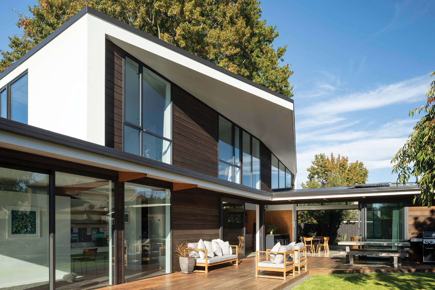
The story of this house begins in the 1940s. Built of concrete and plaster in the art moderne style, it’s eye-catching next to its timber bungalow counterparts. Architect Tim Dorrington of Dorrington Atcheson Architects in Tāmakimakaurau Auckland guesses it was a more thoughtful design than most of the era. “It was arguably a bespoke build for the site. All the rooms make sense where they are, to take advantage of the light and sun.”
So not much needed to change for a long while, except for a newer kitchen that was installed at some point.
But by 2009 it was time for an upgrade. The homeowners at the time engaged DAA to extend the single-level home both up and down. On top of the flat roof DAA and interior designer Katie Lockhart popped up a retro-glam master suite. With shell-pink walls, green carpet, copper sheet detailing and an outdoor bath, it’s exactly the kind of bold design the house could carry.
From the exterior, the top-floor addition blends in, with a bank of windows echoing the existing. The back of the expansion reflects the house’s unique style.
“It felt right to have a curved structure, it was quite an interesting thing to play with,” says Tim. “It’s a membrane roof, and we added ribs to accentuate the curve and to give it some texture.”
At the same time, the downstairs was excavated to create a games room but wasn’t developed beyond the basics.
Further work was done in a later renovation, such as adding the garage.
Six years ago current owners Gina and Rich bought the house.
“I wasn't thinking about moving,” says Gina. “But we found out this house was going on the market, so Rich made a few phone calls and asked if we could have a look. Rich had the vision; it was all driven by him.”
When the time came to make improvements, the choice of architect was obvious. “It made sense to use DAA because they’d done such an awesome job previously, and they knew the house.”
Tim says Gina and Rich’s aim was to improve functionality, and add their own stamp. “The main
crux of the brief was to make the house theirs,” he says. “We’d worked with two previous owners, so it was about making it their home for their way of living.”
From a sustainability – and style – point of view, Tim says he wanted to preserve as much of the original house as possible. “If you can repurpose or upgrade an existing structure so that it can be practical and fit for purpose for a new generation, that’s got to be better than destroying and rebuilding it. But you also can’t limit the way you live your life.”
This time around, the focus was on the kitchen, the children’s bedroom wing, the downstairs area, and simplifying the overall flow.
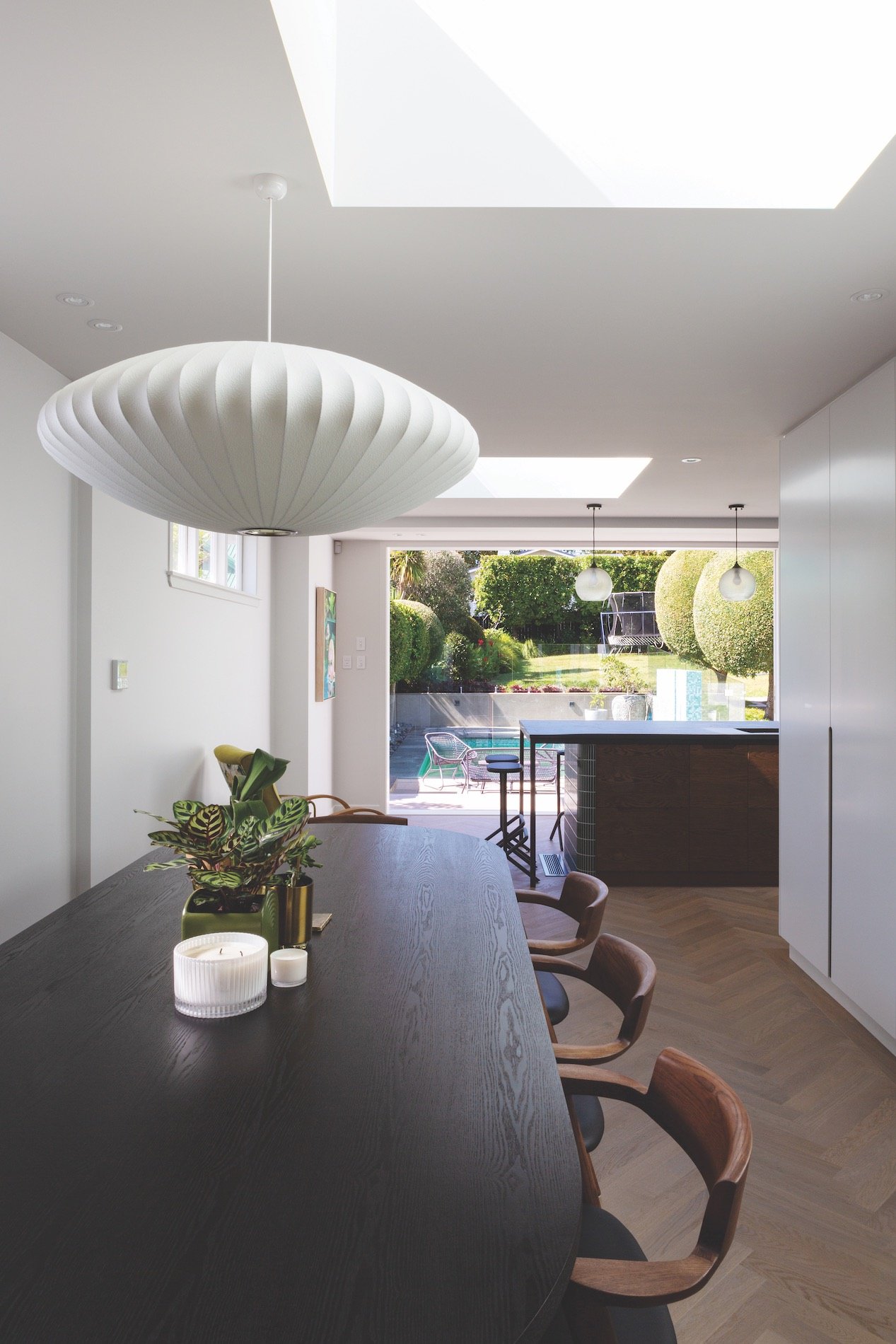
First, the kitchen was moved. “It used to be right at the front where the entry is, so you walked in the front door and tripped over the kitchen. Having it at the back of the house is nicer, opening up to the courtyard, pool area and backyard,” says Tim. “Everyone hangs out in the kitchen, so it’s now in the pivot point between the pool area and the indoor spaces.”
The key idea here was the panelled wall of cupboards that leads from the entry area and wraps around past the dining table into the kitchen. “The materiality of it is a reflection of the white on white of the house. It presents itself as a white block, like a cube, and the rest of the joinery is a natural timber.”
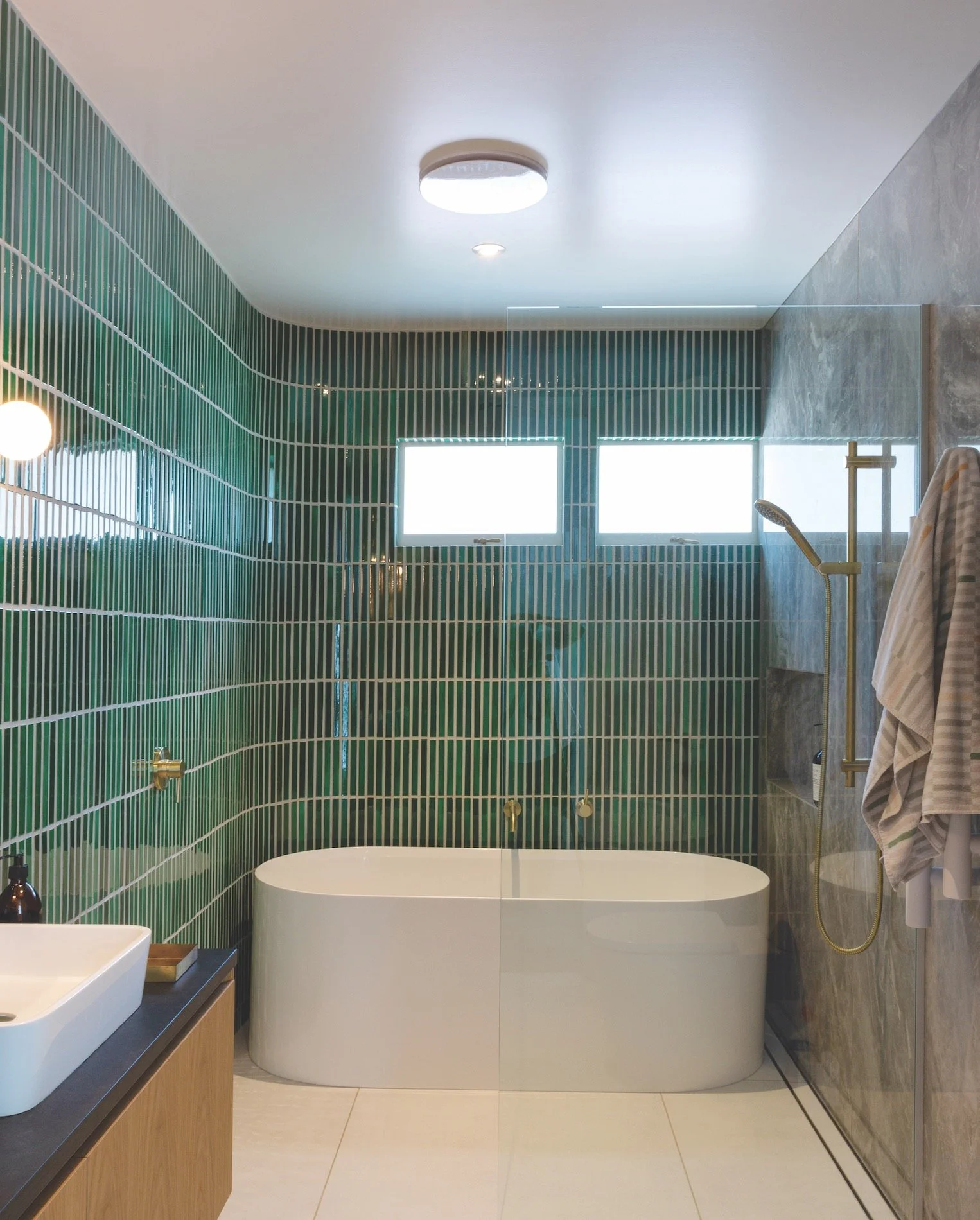
The green finger tiles were chosen to pick up on the green of the pool tiles outside, and because they could curve around the edge of the kitchen island.
As much as possible was integrated into the white cabinetry. “Everything is wrapped away behind the walls,” says Tim. “The island is like a big table that everyone can sit around, but when you open the doors, suddenly it’s a working kitchen.”
Homeowner Gina loves the functionality of the storage, and the mid-century futurist style. The exacting design needed a precise touch. “The cabinetry was done by Hewe Architectural Cabinetry, and they were just so good at their job,” she says. “I think they’re the pinnacle
of cabinetmaking.”
It was a large part of the project, and also included oak screening by the front door, built-in seating in the entry, a desk area in the dining room, and a sideboard in the living room concealing a pop-up TV.
Arches and curves are a recurring motif. “It’s all about the context,” says Tim.
“We don’t do a lot of curves normally at DAA, but this house has curves, so we continued that language. Some quite strong statements had been made with the existing house, so we took those and rendered them, rather than try to twist it into something else. In some projects we try to contrast what’s new, but with this we wanted everything to work together harmoniously.”
Arched doorways grace the reconfigured and simplified hallways, and a porthole window features in the updated children’s wing. “We wanted to get a bit playful by putting in that round window that looks into the pool area,” he says.
The outdoor bath was requested by previous homeowners during an earlier renovation. They were wanting a tropical, spa-like feel as experienced in Bali or Fiji, and the balcony is surprisingly private.
“It’s quite unique,” says architect Tim Dorrington of the Tāmakimakaurau Auckland house that he’s designed renovations for three times. “It’s a grand old dame. It’s not a small house and it’s probably now three times the size it originally was. It has quite a presence on the site.”
Plans for the downstairs area included a gym, bathroom and laundry but Gina had the most fun updating the games room with a moody speakeasy vibe. Built-in seating in the circular turret area reflects the same in the living area upstairs and makes the most of the unusual space. Dark colours, tons of storage and a cedar slat wall that conceals the door make the space a favourite with all the family.
Says Gina: “We drink whisky, play poker, do dodgy deals!” She says she enjoyed working with Tim at DAA. “He’s so relaxed, we always felt completely at ease. It never felt daunting.”
She’s also so happy with the end result. “Now that it’s renovated, it’s amazing, I love that no matter where I sit, I can see something beautiful.”
The key ingredient
Cabinetry throughout the house was pivotal to the renovation. Precision crafted by Hewe Architectural Cabinetry, the timber cabinets in the kitchen are oak veneer with custom rebated handles and curved floating shelves, finished in a custom chocolate stain. The veneer has been crown-cut, which reveals its striking grain. The star is the white (Aalto Sea Foam) polyurethane lacquered cube of cabinetry with custom curves and rebated handles detailed with brushed brass. Appliances, air conditioning grilles and a pantry are all integrated.
Involved in this project
ARCHITECT
Dorrington Atcheson Architects
09 361 6688
daa.co.nz
CABINETMAKER
Hewe Architectural Cabinetry
09 479 6504
hewe.co.nz


