Colour Box
The rich textures and bright colours of architect Kate Ottenés Johannesburg home mirror the lush garden, balancing a sense of energy and tranquility.
“The light that we have in Africa is very different from the light in Europe, for example,” says Johannesburg-based architect Kate Otten. “There’s an intensity about it that also brings out the intensity of the colours.”
These kinds of observations about the quality of light and colour inform her idea of home – or in architectural parlance, “context” – and what it means for a home to belong in its particular setting. It’s something that governed every aspect of the design of her home in Parktown North, Johannesburg – which she shares with her partner, Paris Pitsillides, and their daughter Paloma.
The garden, for example, is a riot of colour. “There is the brilliant, intense red of the dahlias, the pink of the moonflower, magenta of the Watsonias and the purple of the Brilliantaisia,” she says. Even the green – she points out the leaves of the Kniphofias and the stretch of lawn you cross to get to the front door – is intense. “I love a lot of colour in a garden,” she says. “It has a kind of energy. I think it’s fantastic.”
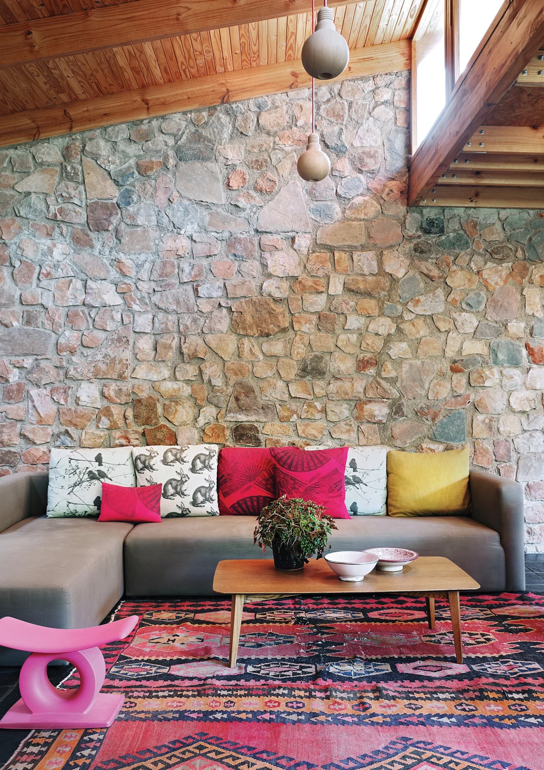
The house itself mirrors the garden in its sensitivity to light, colour and energy. “In the public spaces, there’s lots of pink and red,” she says, referring to the colours of the vibrant wax-print fabrics, bright coloured chairs and stools, and even the artworks. “And then our bedroom is green and blue, which by its nature is cooler and calmer; in the bathrooms, there is emerald green and black – there’s a richness about the colours and textures.”
The house is undeniably colourful, but in no way exhausting or overwhelming. In fact, if anything, the way the colours are combined with natural materials is unexpectedly soothing. “It feels lively and fun,” she says, but ultimately it’s a tranquil, restorative haven for Kate and her family.
Paris bought the house shortly before he and Kate met, more than 20 years ago. “It was a 60s ranch-style house at the end of a narrow strip of land,” Kate recalls: low-slung with a pitched roof, stone walls, knotty-pine ceilings and slate floors. “It had a passage with the bathrooms on the one side and the bedrooms on the other.”
At the same time, it had a magical quality – you approach the house via a long, narrow wooded driveway. The gate is simple and unassuming; as Kate says, you wouldn’t expect that “any architecture has gone on here”. Then, at the end of the driveway, the house is revealed across a clearing of green lawn. “This is an absolute haven,” she says. “You wouldn’t know it was there!”
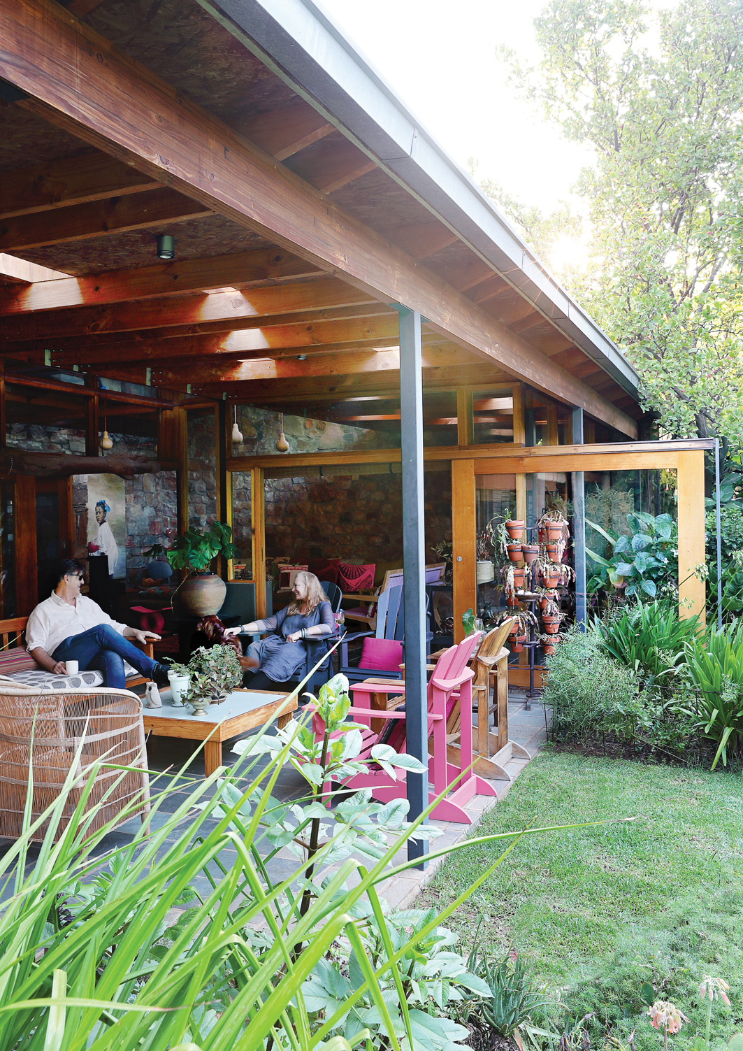
Paloma was born there and the family lived in the house for around a decade, making only small tweaks, before deciding to make a substantial change. Kate concedes that it felt “quite squashed”. The ceiling was low, the rooms and bathrooms were small and dark. There wasn’t a covered veranda or sheltered outdoor space. “The lounge area always connected nicely to the garden, but none of the other spaces did,” recalls Kate.
“The point of doing the alteration,” she says, “was to have more generous, better laid-out spaces. We wanted to lift the roof substantially and connect to the outside spaces.” They also added a level, where Paloma now has her bedroom. “I guess we were thinking, if we don’t put a slab in now, and an upstairs room, we never will,” says Kate. But they were adamant that they didn’t want to renovate away the character of the house they’d grown to love.
Kate’s approach had the right balance of boldness and sensitivity to pull off quite a radical transformation, while perpetuating the character of the house. (She also points out that she ran the alteration as “an official, proper job” in her studio. “We handled it exactly as we would any other project,” she says, right down to mood boards and detailing, weekly site meetings and an agreement that neither she nor Paris would make any unilateral decisions.)
DINING ROOM: The stone wall in the foreground is original, but Kate added the one in the background at the end of the lounge. She extended the slate floors and reprised the knotty-pine ceilings, which were part of the house’s distinctive palette of materials.
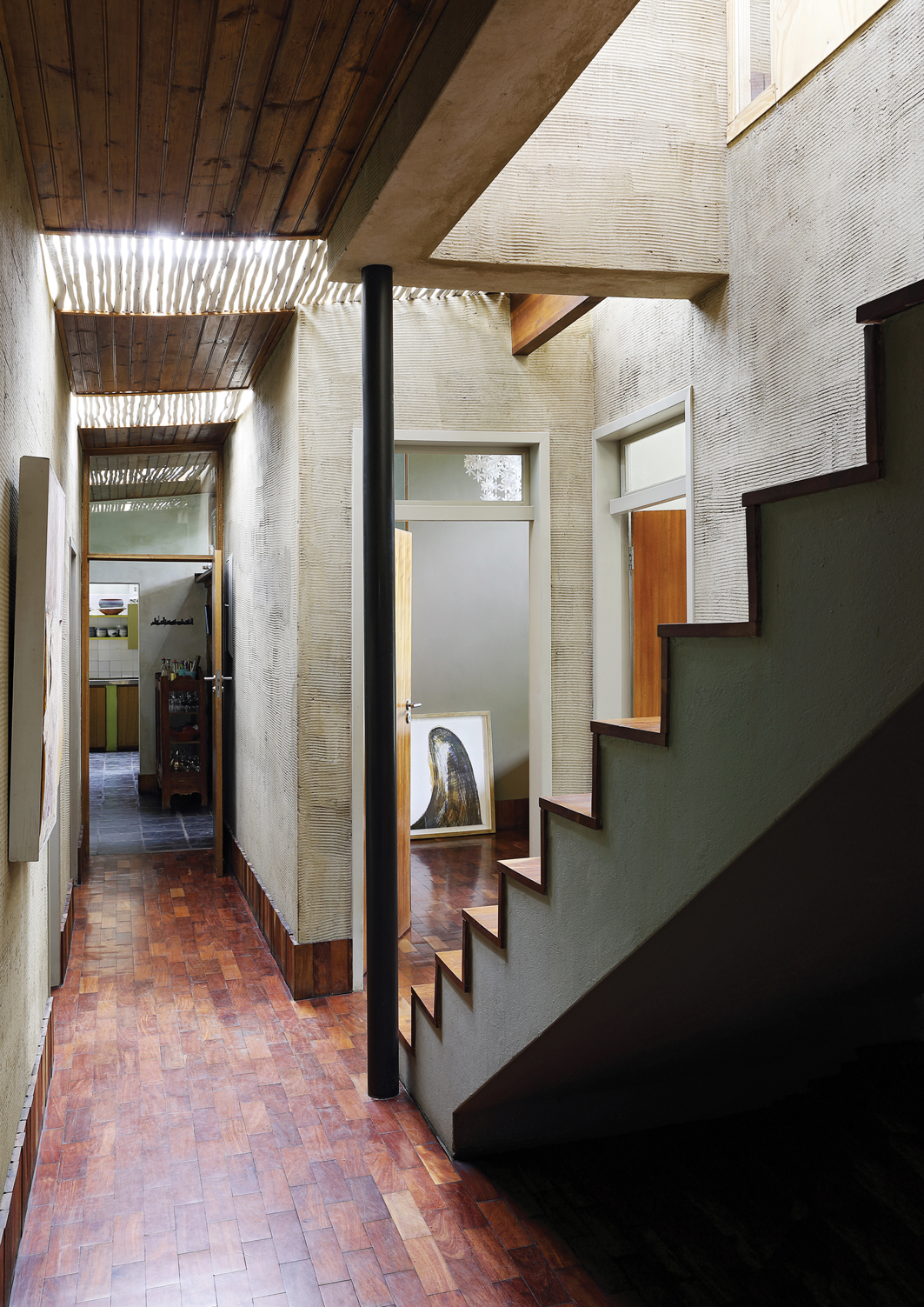
Kate worked with the same distinctively 60s materials that gave the house its personality. She added some new stone walls and extended the slate floors. “We even put in bits of new knotty-pine ceiling,” she says. Existing features were re-used - “the lounge doors – the very same doors – were moved out three metres,” she says; “I had collected loads of old teak parquet from demolitions,” which was used for the private areas of the house. Rather than laying them in the traditional checkerboard pattern, however, she chose a brick-bond arrangement instead, giving an old material a contemporary edge. Similarly, rather than painting the plastered walls, they’ve been raked and sealed. “The walls have an amazing energy that you just don’t get with paint,” she muses.
Reflecting on her approach, she says that she’s come to think of the renovation as a contemporary interpretation of the 60s aesthetic that characterised the house. “There’s an artistic take on it,” she says, rather than a literal relationship. “It’s more like a commentary, so that you don’t lose the thread of what it was, but it becomes wholly new,” she says. “The language of the house continues in its original sensibilities, but it is rewritten, rescripted.”
HALLWAY: The private areas of the house feature teak parquet floors, which Kate had collected and stockpiled. They have been laid in a contemporary brick-bond pattern rather than the traditional checkerboard, creatively reinvigorating an old-fashioned material. Knotty-pine ceiling and a raked plaster finish on the walls add to the textural richness.
The sliding doors in the lounge slide right out into the garden so that, when you open them, they extend the room outwards, almost enclosing a patch of garden and letting it spill into the house.
Similarly, when the sliding doors of the main bedroom slide away, the boundary walls of the garden courtyards become the edge of the room. It’s that sense of openness that allows the bright colours and energy of the house – the bursts of colour and the African wax prints – to be calming rather than exhausting or too intense. The natural palette of the house, and the “woodedness” outside, she says, “cools things down”.
“It’s completely tranquil. It’s rich,” she says. “I think it’s very restful.” Its secret is that it doesn’t dampen the mood or sap energy. Rather, it is energising and uplifting. Creating the house together with Paris, she says, “was an incredibly successful event in our lives as a family.” In Kate’s portfolio of projects, it’s referred to as “Our House” – something it has truly become.
THE MAIN BEDROOM AND ENSUITE BATHROOM: opens onto a courtyard at the back of the house, “so everything moves beyond the edges,” as Kate puts it. The wooden floors join seamlessly with the exterior tiling. Kate anticipated the trend for black bathroom ware by almost a decade in her choice of enamelling, which she combined with emerald green. “There’s something a little bit oriental about the black and green,” she observes, noting how well the green of foliage shows up against a black background.


