A softer side
A feature white benchtop softens the industrial use of timber and black in this striking kitchen by Palazzo Kitchens & Appliances. We talk to designer Pieta Fletcher about what makes it special
Tell us a bit about this kitchen.
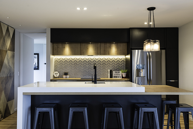
The clients, Tarryn and Antony Deaker, wanted a quality kitchen that worked within their investment level, without compromising on design, and our German-made kitchens were a perfect fit! The finished kitchen is in the style they wanted and is tailored for their requirements. It is practical with plenty of storage, including a pullout pantry, storage above the work area, and plenty of drawers.
What makes it stand out from the crowd?
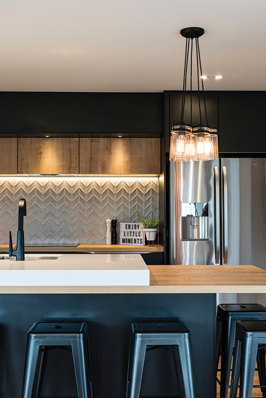
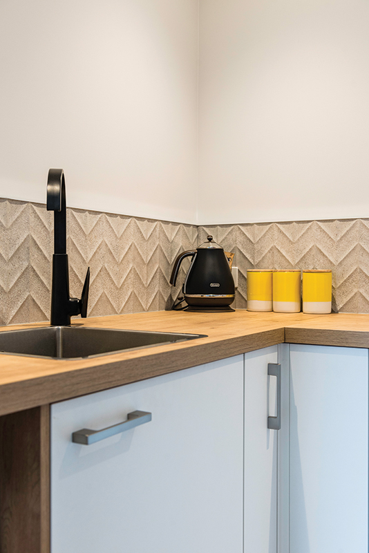
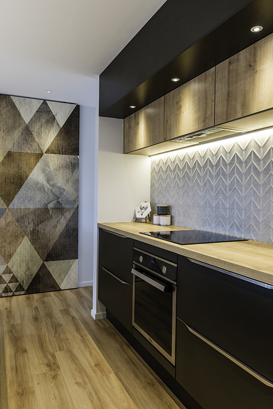
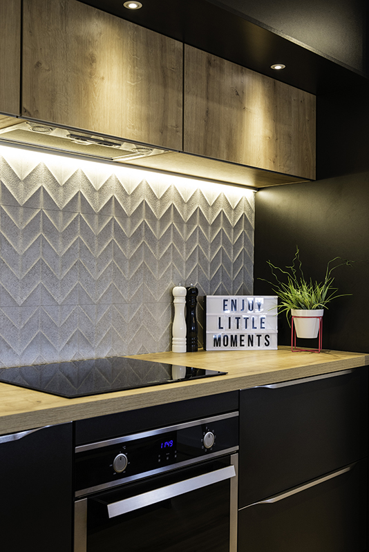
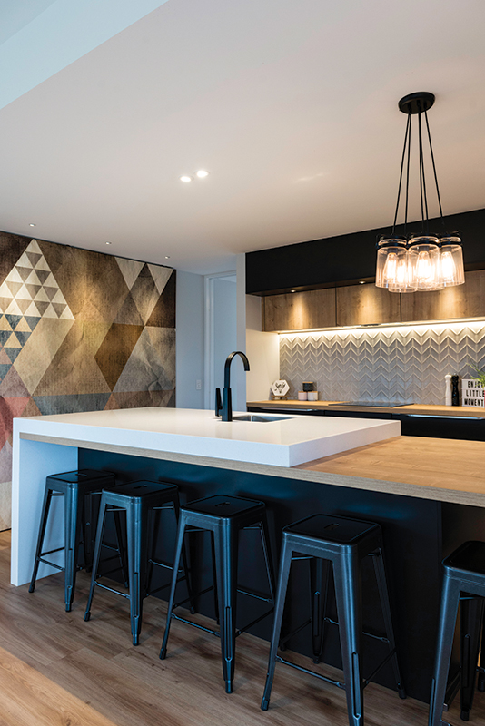
The kitchen is different from your standard kitchen, with the mix of bold colours and of course the feature island. The Deakers added a tile splashback with a great texture, which contrasts well with the dark joinery, while tying in with the acrylic island benchtop.
The island benchtop is a really interesting combination of materials. Tell us a bit about this.
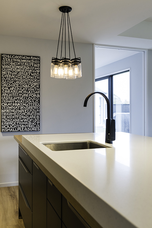
The island joinery is in Terra Black Melamine with an Oak Provence Laminate for the benchtop. This was then overlaid with an 80mm-thick acrylic benchtop and waterfall end on one side. Acrylic was chosen for the feature top to avoid joins, ensuring a seamless finish.
Tell us about the use of lighting and texture in this kitchen.
One of the main considerations for Tarryn was tying the laminate timber-look benchtops in with the flooring. The Oak Provence works really well and has enough texture to liven up the design, but is subtle enough to work with the flooring texture. Their lit-up tile splashback is also a real feature, as are the downlights onto the Oak Provence cupboards. Those finishing touches really help make the design stand out.
What other areas of the home were you involved in?
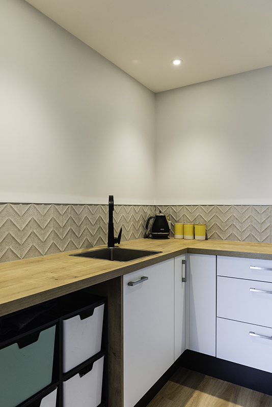
The walk-in pantry and the study desktop. To keep the pantry light and bright we specified Oak Provence Laminate benchtops on white joinery, and continued with an Oak Provence Laminate desktop in the study. This allowed a flow of the kitchen materials to other areas of the home.
A Q&A with homeowners, Tarryn & Antony Deaker
What was your design brief?
We had a pretty specific design brief to be fair. We had taken the liberty of photo-shopping things we loved together to make our dream kitchen, and took that in to meet with Pieta. We'd used concrete and wood in other areas of our house so we were keen for the kitchen to anchor that in the interior.
What is your favourite part of the kitchen?
We love the balance and interaction between all our textures, elements and colours. The big thick acrylic slab is something we absolutely love and the differing heights of our benchtop –we find the extended countertop an incredibly practical and useable space.
Why Palazzo Kitchens & Appliances?
We were after a combination of surfaces that was a little edgy but didn't feel cold, and we loved that the Palazzo wood surfaces had a lot of the naturally imperfect characteristics that real timber has.
We found the team great to deal with, and Pieta really grasped the slightly soft/warm industrial look we were trying to achieve. It made the whole process so enjoyable and not the slightest bit stressful.
03 366 6948 | palazzokitchens.co.nz
Photography: Kate Claridge


