Velvet Underground
The muted glamour, endless volumes and monochrome palette of this converted cottage colour everyday life with a touch of magic.
Words Graham Wood Photography Greg Cox
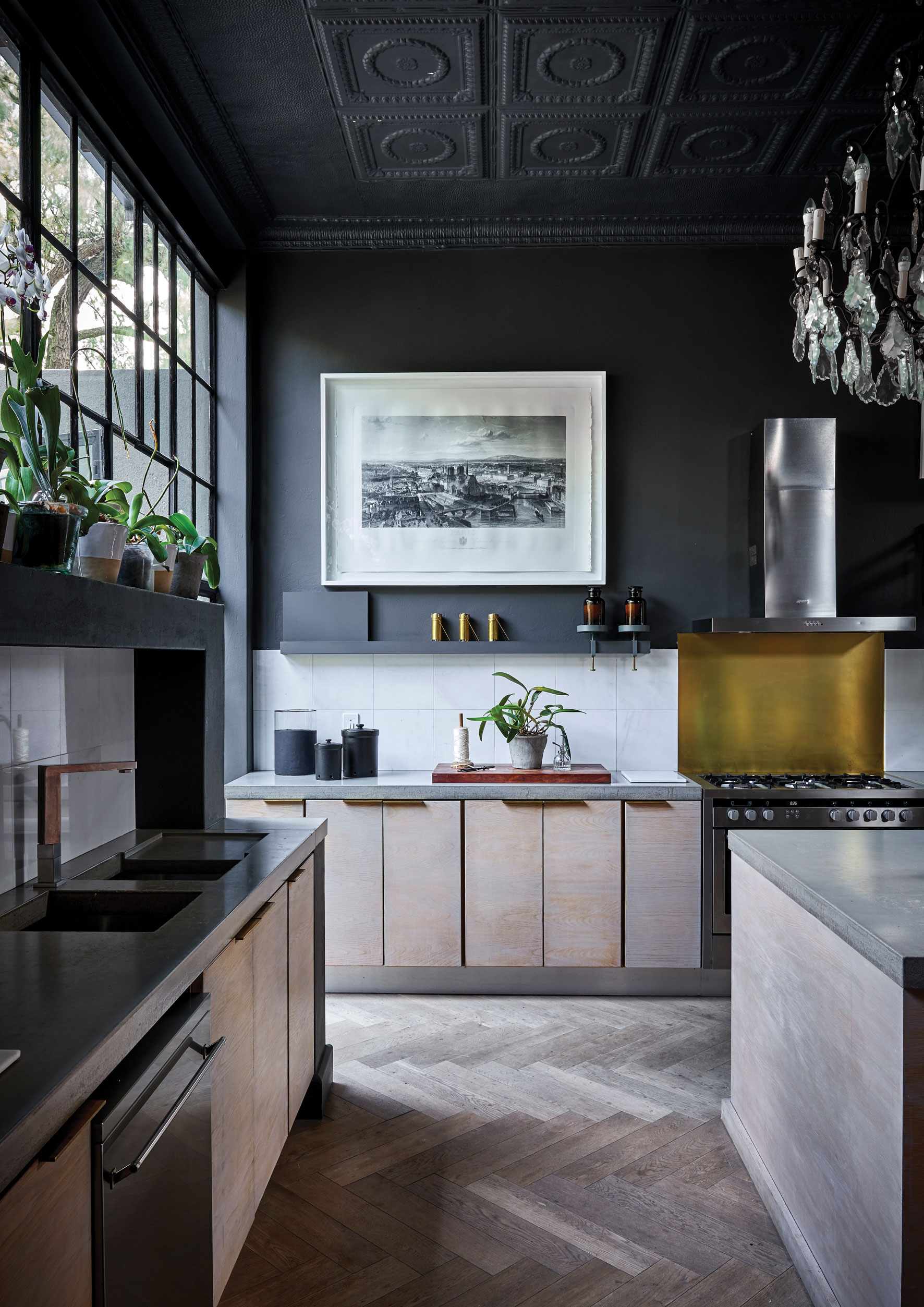
KITCHEN In the kitchen, Christian and Anli introduced high pressed-metal ceilings in keeping with the original architectural style typical of the area. The cottage pane windows and profusion of orchids make it feel a little like a greenhouse or conservatory.
The design of Christian van der Walt and Anli Jones’s Johannesburg home began with a door. They came across a tall, narrow, wrought iron chateau door in an antique shop near to the cottage they’d moved into in the Johannesburg suburb of Parktown North. The door was rusted and had no glass in it, and no handles, but it awakened a vision. “We thought: this is great,” recalls Anli. “Now, how do we make it work?”
The house as it is now is largely a response to that question. It was essentially a granny cottage, once an outbuilding on a plot with a larger house, which has since been converted into a street-facing interior design studio. The stand was subdivided, so as a result, the cottage was hidden at the end of a strip of land along a bumpy, narrow driveway. When the couple first moved in, it had yellow painted bricks, knotty pine ceilings and avocado bathrooms.
OUTDOOR DINING A covered patio between the main living area and vegetable garden makes for a beautiful outdoor dining area. The outdoor table was custom made by Dahla Hulme. The pendant lights are made with vintage rulers, and came from La Grange Interiors.
Christian, who works in the field of special effects and animation in film and advertising, and Anli, who has a background in fashion design, designed the house themselves. With the door in mind, they sketched ideas on napkins over many dinners, and eventually a plan started to emerge. “At my last office, my neighbour was an architectural firm,” says Christian. He ended up helping them to create cinematic “visualisations” for some of their projects, so had a little experience creating three-dimensional renditions of rooms from architectural sketches, and worked up the plans.
Over three years, he and Anli went about transforming the cottage into a kind of modern tower in an enchanted garden. “We did it in stages, so we used the layout of the old building and just enlarged and extended,” says Christian. As they built in one area, they lived in another, until they’d come full circle. “Exactly as you shouldn’t,” he adds.
Originally, the ceilings were meant to be the height of the tall antique door, which they had beautifully restored, but one evening during construction, Christian and Anli arrived home from work to discover the builder had mistakenly added an extra metre to the wall. “He said to us, ‘can we leave it?’” recalls Anli. They conceded that it would be more work to undo what had been done, and so they went with it.
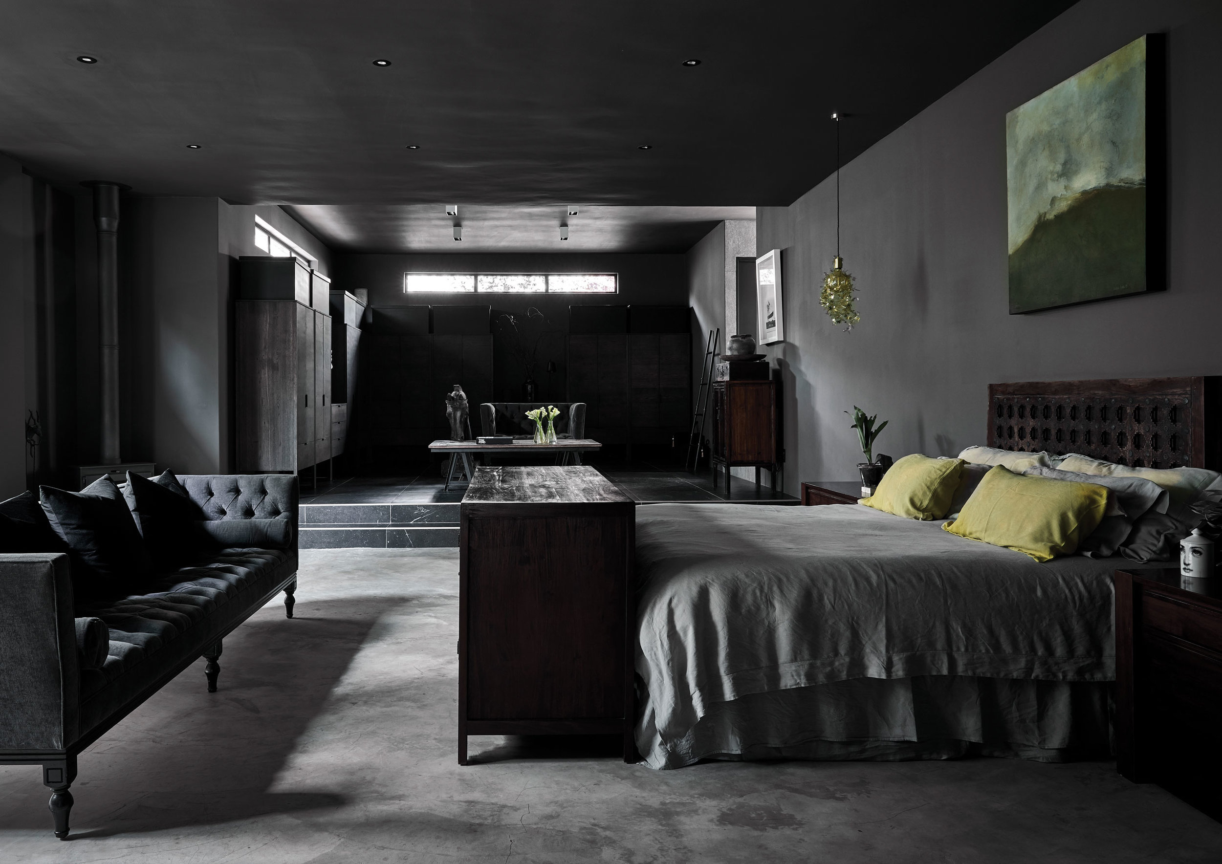
The exaggerated volume, particularly in the central living room and the adjacent study-cum-guest room – for which the ironmonger who restored the original antique door created a matching replica – is at the heart of the character of the house. The height, combined with the black walls and the monochrome furnishings of the interiors, creates an almost undefined sense of space: “limitless” as Anli describes it. Especially at night, you’re almost unaware of the ceiling and the walls seem to recede, simply enveloping the interiors in a dark, velvety atmosphere of mysterious luxury.
Contrary to the standard idea of a white cube, the dark walls are a trick Christian says he has noticed in a number of art galleries. “I took a photo in the Louvre, and it was the same setup,” he says. The National Gallery in London has never had white walls, and he noticed it again at the Scottish National Portrait Gallery in Edinburgh. “The walls disappear, but they also make whatever you put in front of them pop,” he says. “You’re seeing the things in the space, not the space.”
He calls the house a “showcase space”, because his and Anli’s eclectic collection of art and artefacts, books and furnishings come to life in the chiaroscuro of each room, as if in a cabinet of curiosities. There are contemporary local designs and vintage pieces – local, up-to-the-minute artworks and restored portraits in oils picked up at auction.
The atmosphere takes on an almost fantastical dimension, a kind of glamorous glimmer that also seems to resolve the combination of antique and contemporary design. The two sofas in the centre of the living room sum up the basis of the interiors: an old beaten-up black leather Chesterfield, and opposite, a modern cream Italian one. Almost everything, if it doesn’t have a metallic glint, is either black or white… and mostly black. The atmospheric lighting imparts sparkle and romance. “It’s like a little romantic hole in the wall,” says Christian. “When you have the candles on the fire going, it really is magical.”
The dark exterior walls also work to emphasise the greenery of the garden rather than drawing attention to themselves. Christian and Anli have planted a beautifully lush formal vegetable garden – “It never seems to know when it’s autumn or winter,” says Anli. “I think it is incredibly sheltered, so it stays green all year.” – and there are box hedges and olive trees that create exterior rooms for al fresco dining and entertaining. The air is scented with lavender. There are even quails, which have had chicks. “They look like popcorn!” exclaims Anli.
This almost pastoral dimension of life down the panhandle is an exploration of urban green space that Anli and Christian find affirming. “The ability to live like you’re in the country, but in the city, is something we aspire to,” says Christian.
BEDROOM The master bedroom and dressing room emphasises horizontal space in contrast to the vertical space of the living room. The sofa is from Julian Decor and the garland light is by Tord Boontje.
Despite their home’s heady combination of whimsy and glamour, the satisfaction Christian and Anli find in something like cooking with herbs from their own garden, while living in what is essentially a rapidly urbanising area, is a surprisingly contemporary ideal.
But then again, Christian and Anli are firm believers in functional aesthetics. The copper pots and pans in the kitchen – the crystal chandelier – are undeniably beautiful, but, says Christian, it’s all part of taking pleasure in ordinary things. “It’s about the joy of everyday objects,” he says. “If you’re going to cook three meals a day, then it might as well become something that you love doing.” If you’re going to live in a place, it should be uplifting.
The romance of this suburban castle is not so much an escape from everyday life as a haven of beauty and glamour – and more than a little fantasy – that paradoxically grounds Christian and Anli; it makes being at home a “worthwhile experience”.
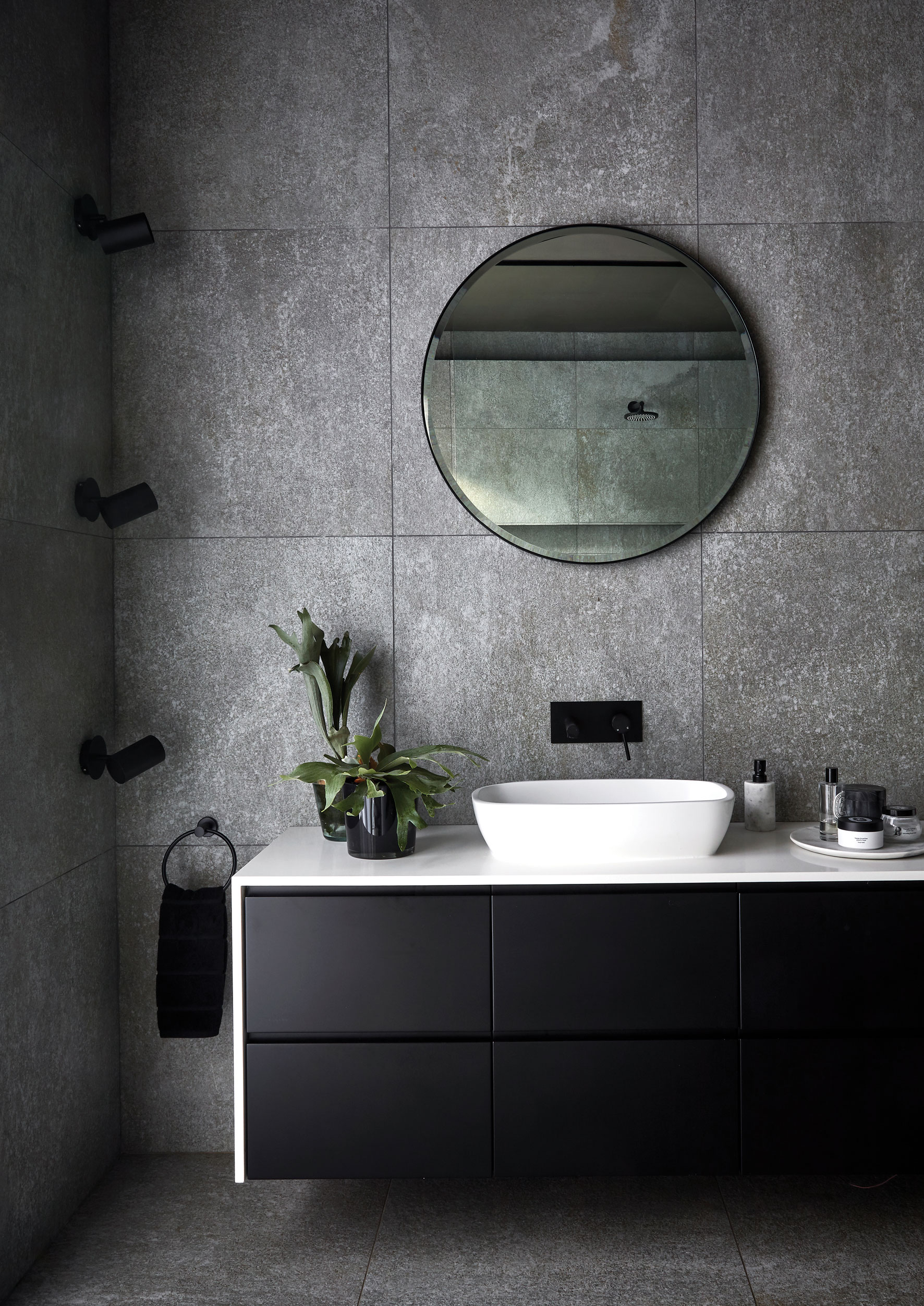
BATHROOM The ensuite bathroom opens onto a courtyard, and includes basins by Dado and taps by Meir from Flush Bathrooms and cabinets by Make Furniture.


